Blo
g
- 15 October 2016
- Eugene Shuliakivskyi
- Layout coding
That's a final article in the series dedicated to Gulp. In the article, we'll deal with the processing speed as well as some other specific features of Gulp.
Let's get back to the processing speed that I mentioned at the very beginning and compare how fast a task will be performed in three cases – using SASS on Ruby, we have had the article on it, Grunt, and Gulp. The task is to compile a stream of .scss files.

- 10 October 2016
- Eugene Shuliakivskyi
- Layout coding
In the previous article, we've learned some theory, so now we can start practicing – we'll write our first task.

- 9 October 2016
- Eugene Shuliakivskyi
- Layout coding
Today, I'll tell you about the task manager called Gulp and also I'll show you how to set it up for some basic front-end developer's tasks.

- 16 May 2016
- Khrystia Novak
- Design
- Layout coding
When the project is being tested, many clients want to know if the website is responsive.
Obviously, the most reliable way is to use the internet site from different devices. This is what we do.
But what to do if you have only two or three gadgets at your disposal?
- 26 December 2014
- Roman Baluk
- Layout coding
This is the first article in the series of lessons on a great tool for layout coding – SASS. SASS is a CSS preprocessor, in other words, it's a program that performs preliminary processing of data. In layman's terms, it's a tool that generates CSS code automatically.
In this lesson, I'm going to explain to you how to install SASS.
- 13 June 2014
- Roman Baluk
- Layout coding
Sometimes when coding a website, front-end developers use jQuery if CSS doesn't fulfill their needs. There can be many reasons for this, one of them is simply Cross-Browser. Today, I'm going to tell you how to make vertical and horizontal alignment of the blocks to their parent elements.
- 13 June 2014
- Roman Baluk
- Layout coding
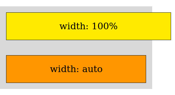
I'm not sure if every front-end developer has ever thought of the difference between width:auto and width:100%. At first sight, everything seems pretty clear: if you set width:100% for the element, it'll occupy all space within its parent block. If you specify width:auto, the element will be of the same width as its content. Logical? Yes. Correct? Not really!
- 2 August 2013
- Volodymyr Hodiak
- Layout coding
For now, this article is available only in Ukrainian and Russian.
We will translate it into English also. Have a nice day and come back soon!
Someone had to do it!

Site of logistics company «REAL TRUCKING»

Packaging and label design for Metro Cash and Carry Ukraine
When you are picking out anything on shelves in a store, you always pay attention to the packaging design. And if you are a customer of "METRO", you must have seen our works

Design for Trainmedo Android app
Do you have a dream to become the world champion horse rider, but you can't find a trainer? Not a problem. The practical Android app Trainmedo can help you solve this

Wishround Corporate Identity
Check out how we helped a cool startup to become recognizable and attract solid investments just by drawing a fabulous brand identity for it!