What Color Should a Button Be
- 18 August 2014
- Olha Mzhviachni
- Design
- 4358

Everyone who's engaged in design faces a perennial dilemma – what color should a button be? Red or green? It's like “To be or not to be?”, So opinions differ.
My point is, the color of the button doesn't matter, what matters is its visibility. Ta-da, I've revealed a great secret of the Universe! )))
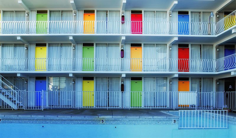
Let's figure it out. In the previous article, I've explained how people perceive colors. In a nutshell, perception is rather subjective than objective. Consequently, we assume that color of the button doesn't matter. How come? We do need to get clicks, leads and to increase conversion. What shall we do if there's no suitable color? Contrast is the solution. This method is very conventional in design. Personally, I like combining chromatic secondary colors. It's cool, fresh and visible.
Try it and probably you'll find the right color.


