The difference between the width: auto and the width: 100%
- 13 June 2014
- Roman Baluk
- Layout coding
- 26450

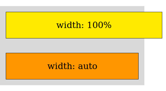
I'm not sure if every front-end developer has ever thought of the difference between width:auto and width:100%. At first sight, everything seems pretty clear: if you set width:100% for the element, it'll occupy all space within its parent block. If you specify width:auto, the element will be of the same width as its content. Logical? Yes. Correct? Not really!
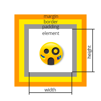
Let's revise block-level elements of a website:

- an element itself;
- padding — an area around the content;
- border — a frame around the element;
- margin — an area outside the border.
By default, the width of a block-level element is calculated without padding and border.
If width:100% is specified, the element will occupy all space within the parent block, but let's not forget that the level-block elements also contain margin, padding, and border. So if they are greater than zero, the element will go beyond (or expand) its parent element (element + padding + border + margin > 100%)!
If width: auto is specified, the level-block element will be within the parent element*, even if it has margin, padding, and border. This is where the difference between width:auto and width:100% lies.
So next time, when you set width:100% to expand the level-block element to occupy all width of the parent block, probably it would be appropriate to set width:auto. This will save your time for figuring out why the child element is wider than its parent block! :)
*Block-level element shouldn't contain float, otherwise its width on condition that width:auto is specified, will be equal the content.


