How to test the adaptive/responsive design using a browser
- 16 May 2016
- Khrystia Novak
- Design
- Layout coding
- 9579

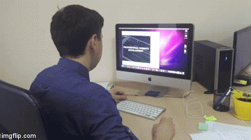
When the project is being tested, many clients want to know if the website is responsive.
Obviously, the most reliable way is to use the internet site from different devices. This is what we do.
But what to do if you have only two or three gadgets at your disposal?
Everything is easy – visit the website from a desktop and use a browser.
P.S. But if you are just randomly resizing the window, that's not the way to do things.
In the article, I suggest focusing on two browsers - Google Chrome and Mozilla Firefox.
Google Chrome
1. Go to the site. For example,www.otakoyi.com:)
2. Go to so-called browser console.
You can do this in three different ways:
Either press F12 on the keyboard (not F+1+2, but F12!!! Things do happen...)

or Ctrl+Shift+I
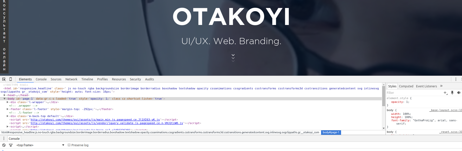
or go to the menu bar in the browser, chose More Tools and Develop Tools:
.png)
3. You'll have something like this on the screen. This is a console.
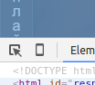
4. Click the mobile device.
5. You'll have a wonderful panel with several options:

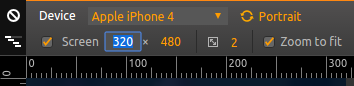
6. Go to Device – Select a model and pick the device. For instance, let's pick Apple iPhone 4.
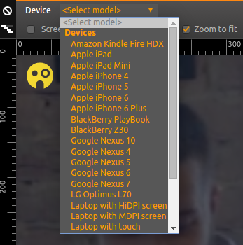
What to do if you haven't found your device in the list? It's also easy, below you can type in the parameters of the device (in pixels):
7. Now it would be good to refresh the page by pressing F5 or Ctrl+R (or even better Ctrl+F5) on the keyboard or the Refresh Page button (next to Back and Forward buttons) in the browser window.

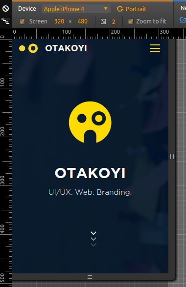
Ta da! Now you can check on how the website will look on the chosen device, in our case, it's Apple iPhone 4:
Mozilla Firefox
1. Go to the site that has to be tested. I go to www.otakoyi.com, here else could I go ;)
2. Go to so-called browser console. This can be done in two ways:
Press Ctrl+Shift+M
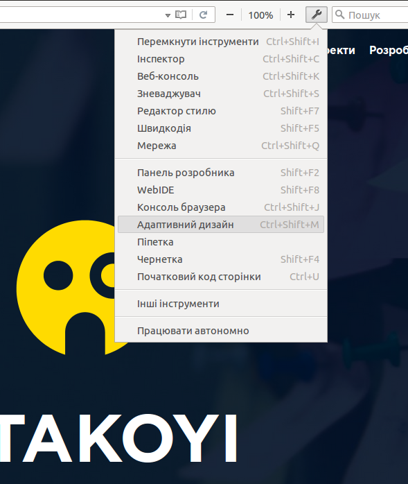
or Click the wrench icon (next to zoom in/out buttons and search bar) in the browser window.

3. In the drop-out menu, click Responsive Design View.
4. Now, it's time to reload the page (how to do it is mentioned above).
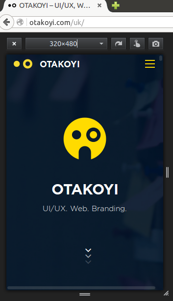
5. Congrats) Now you've got the bar where you can choose parameters of the device in question or just type them in:
I hope this article is useful, and you have leveled up your skill in testing the responsive design.
If you have any questions, leave them in the comments. We'll be happy to answer them :) Or not to answer.


